
At NORTHERN, we developed a distinctive brand identity for Binnenbandjes.nl, an innovative tyre repair delivery service in the Netherlands. Our goal was to create a strong, recognizable brand in a saturated market.
Design Elements:
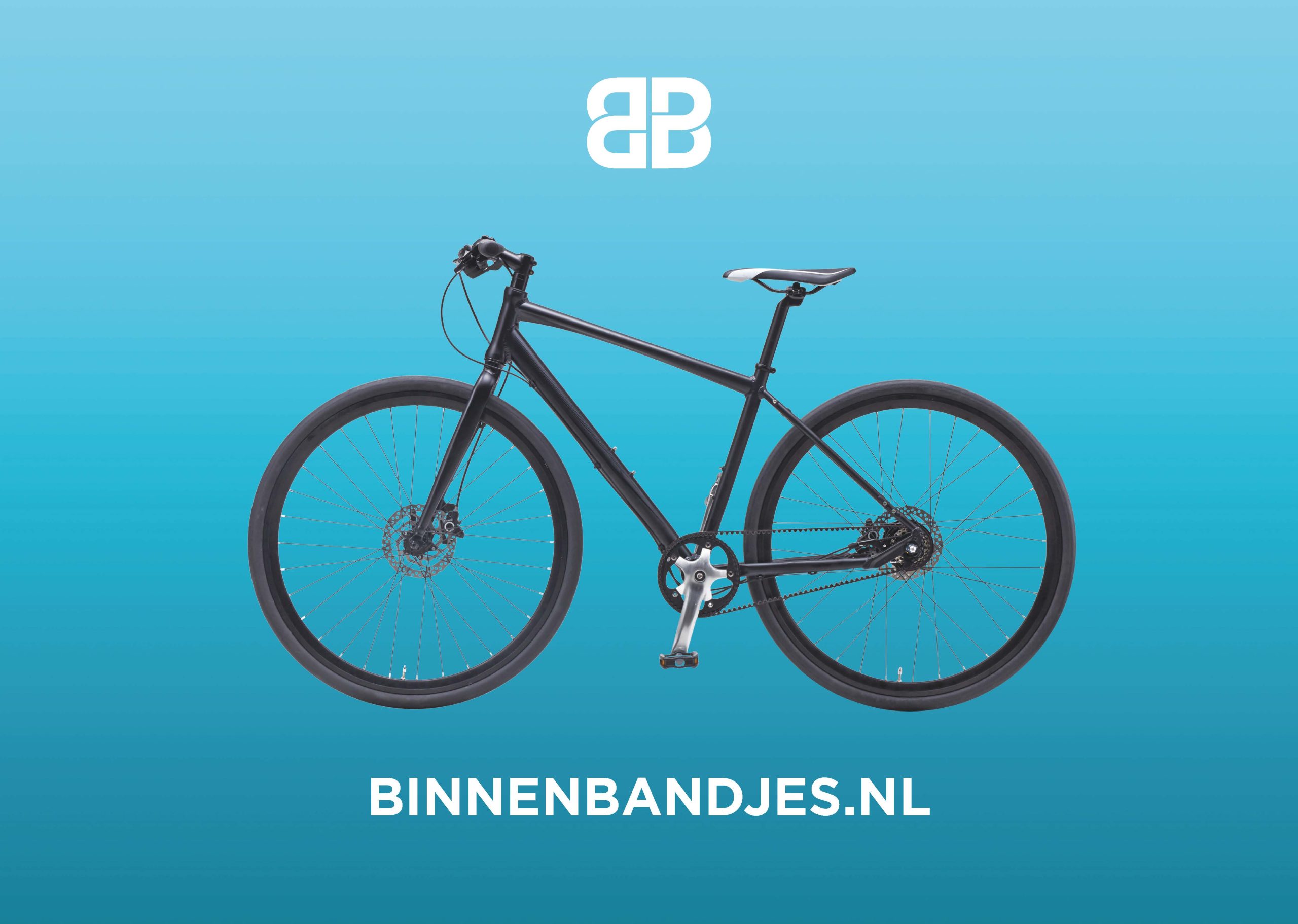
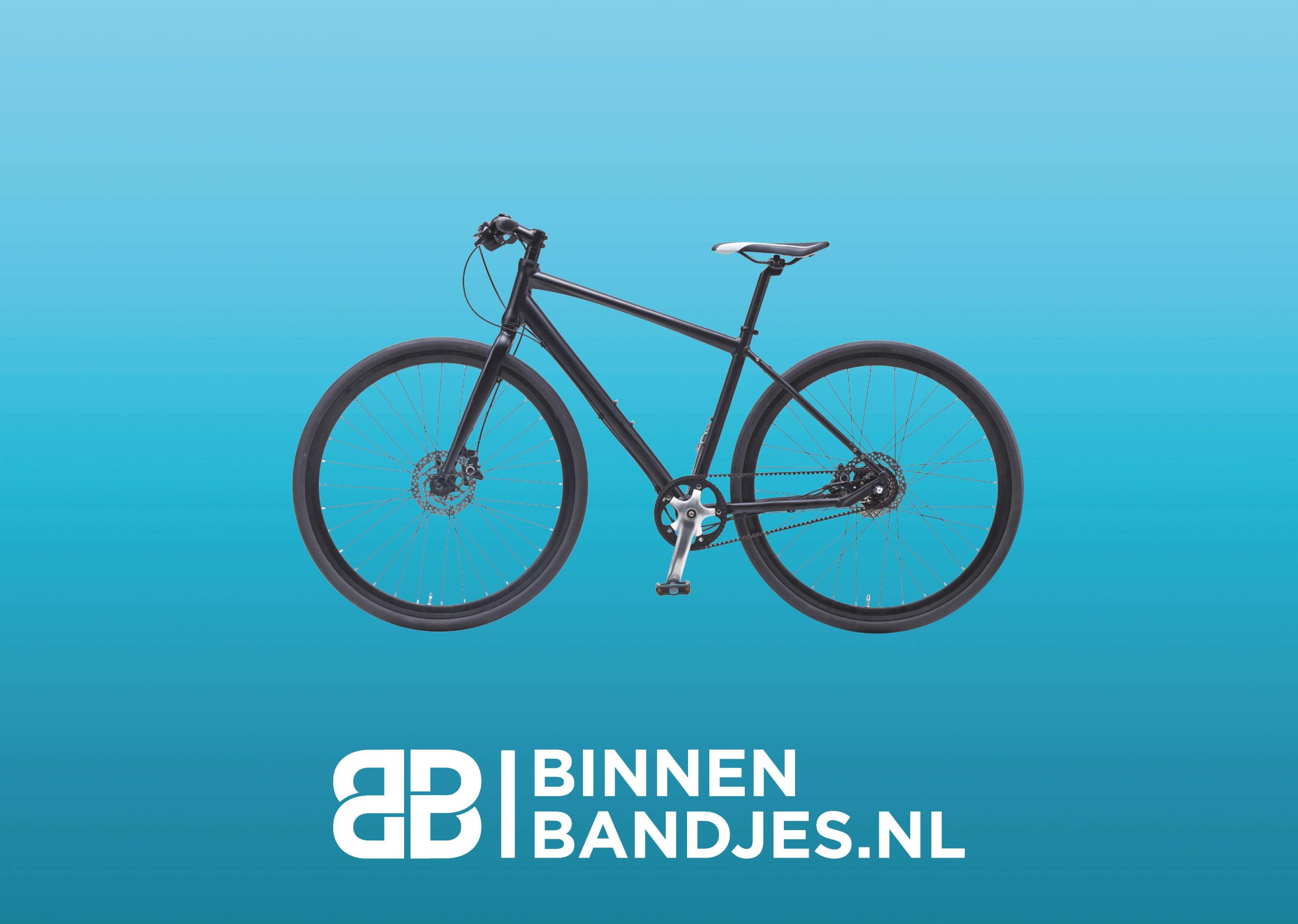
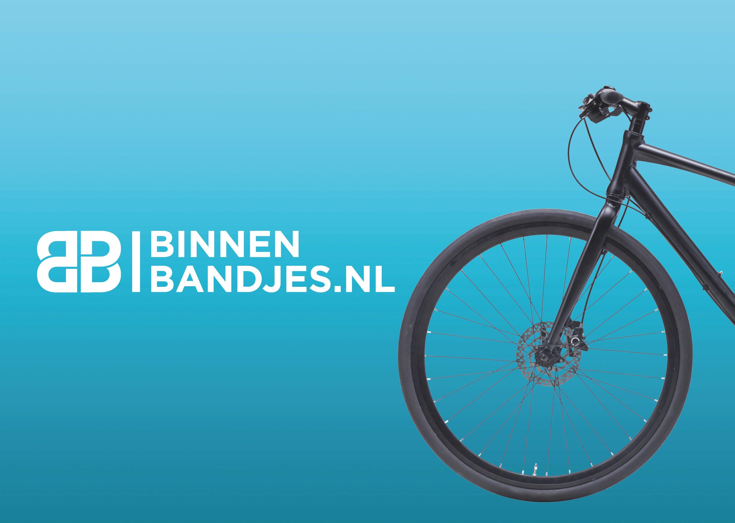
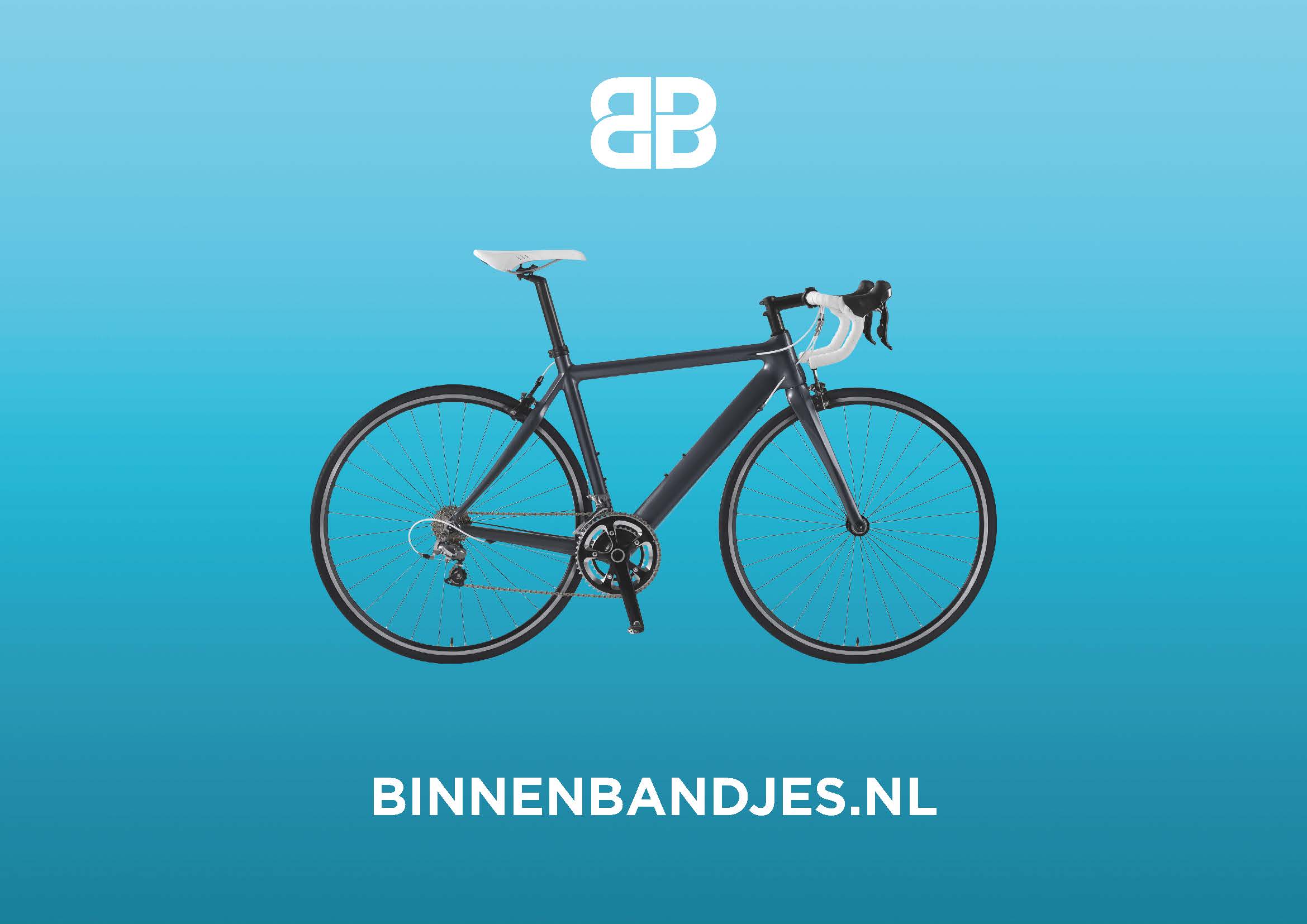
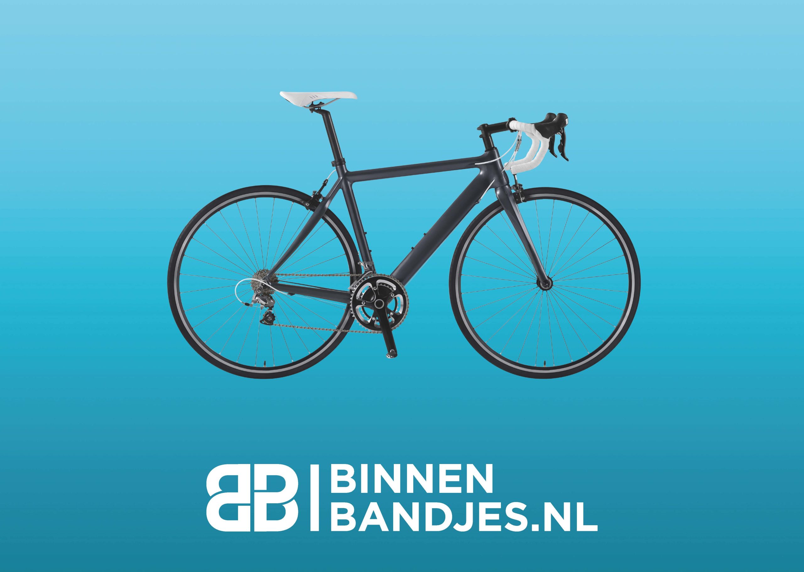
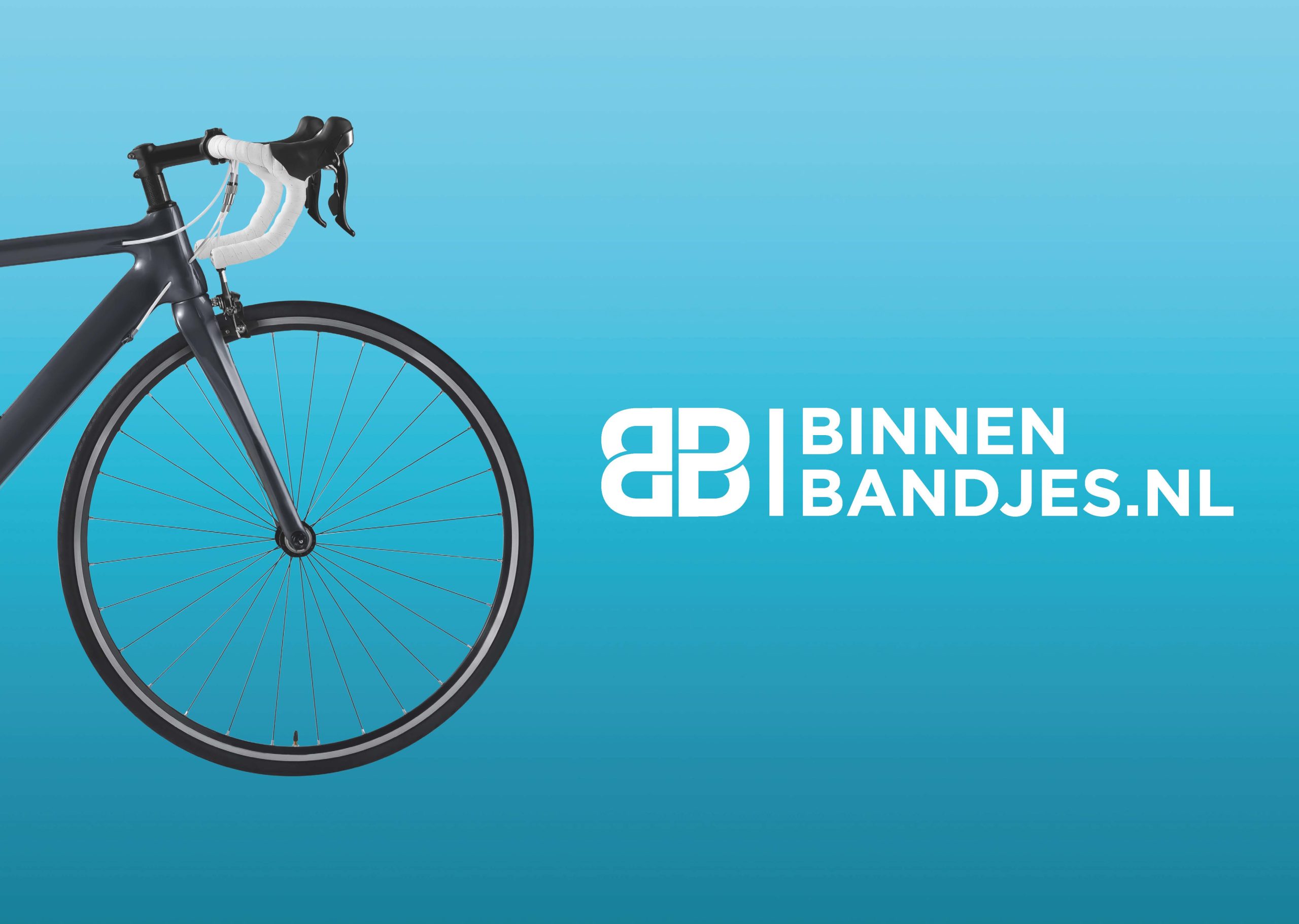
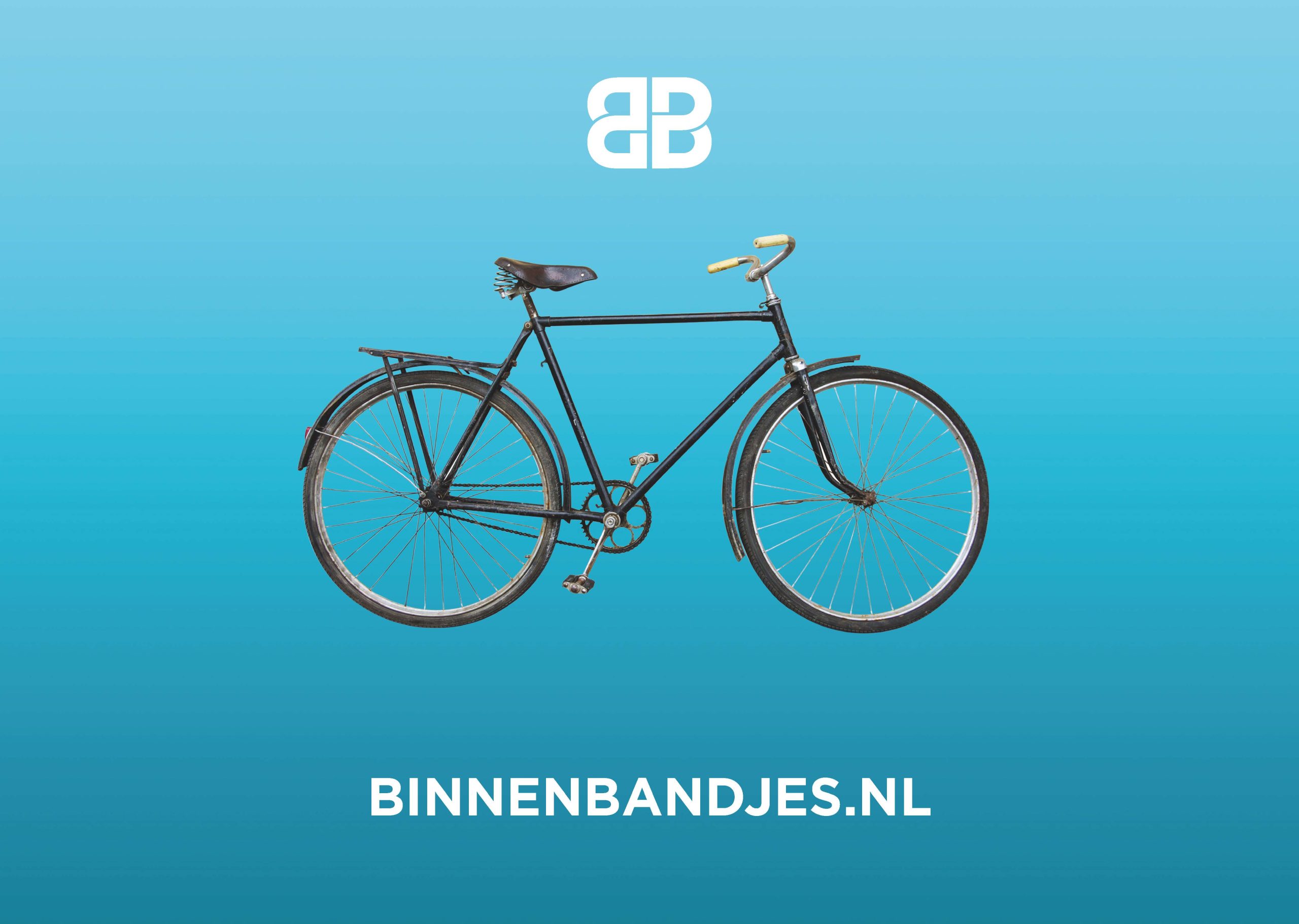
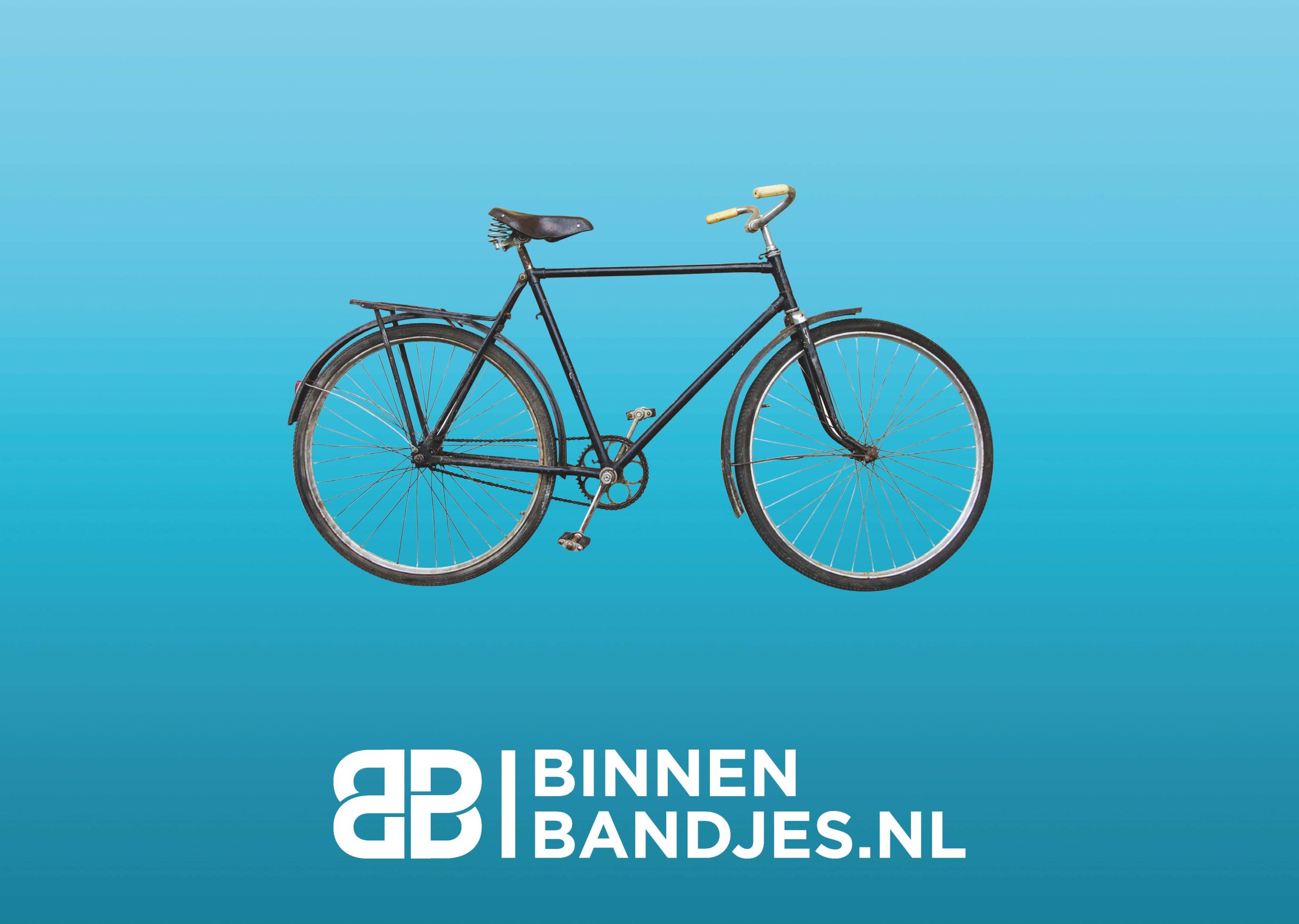
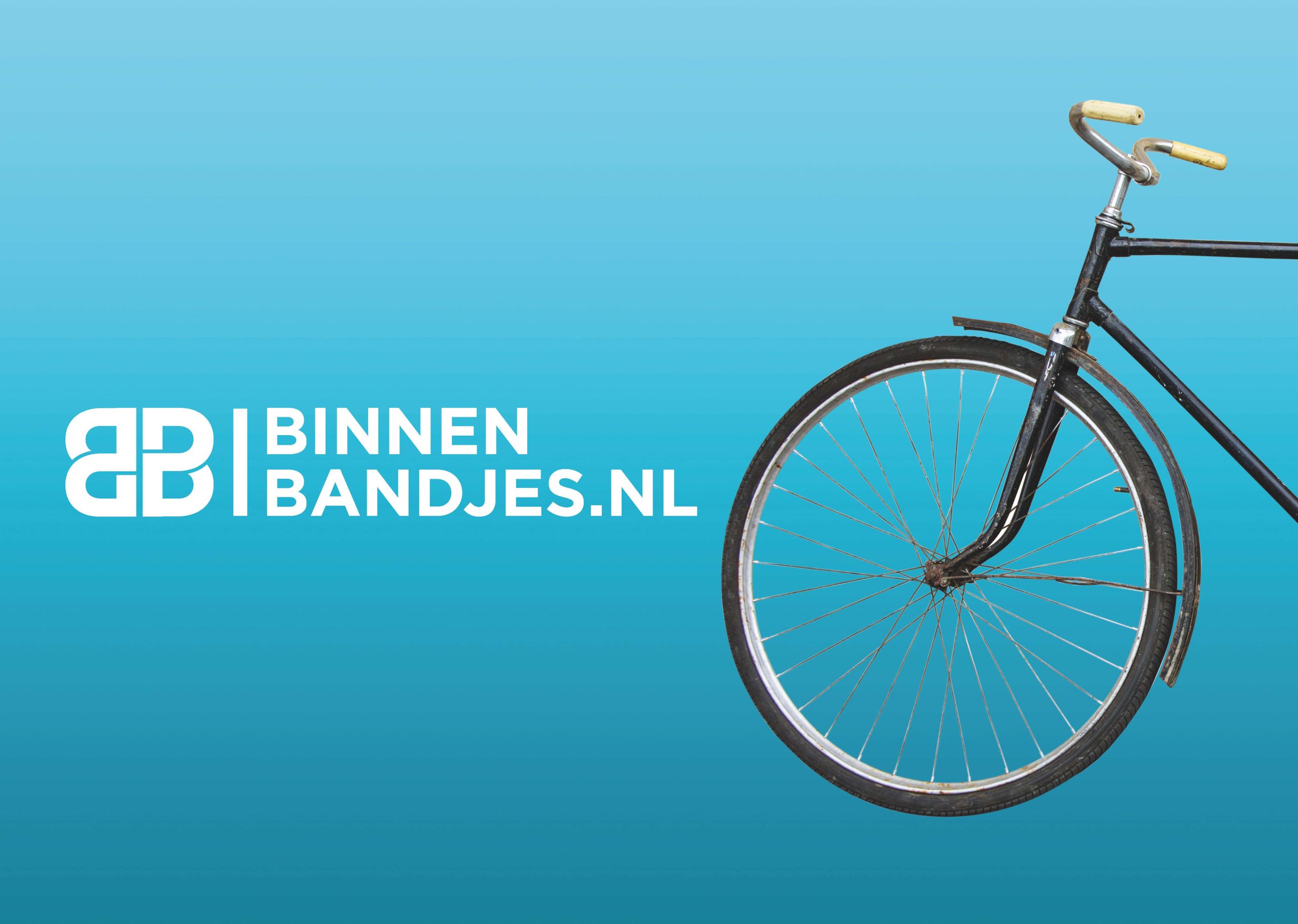
- Custom Logo Design: Bold and powerful, incorporating elements that symbolize the movement of bike pedals and wheels.
- Brand Colors: Utilized Dutch colors to reflect local heritage.
- Typography: Bold typefaces to stand out in the market.
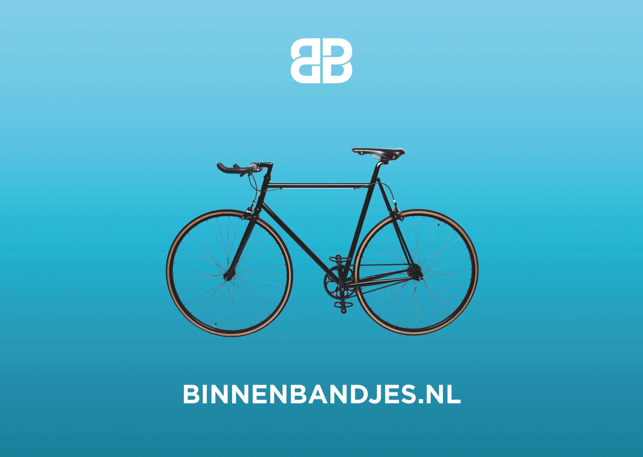
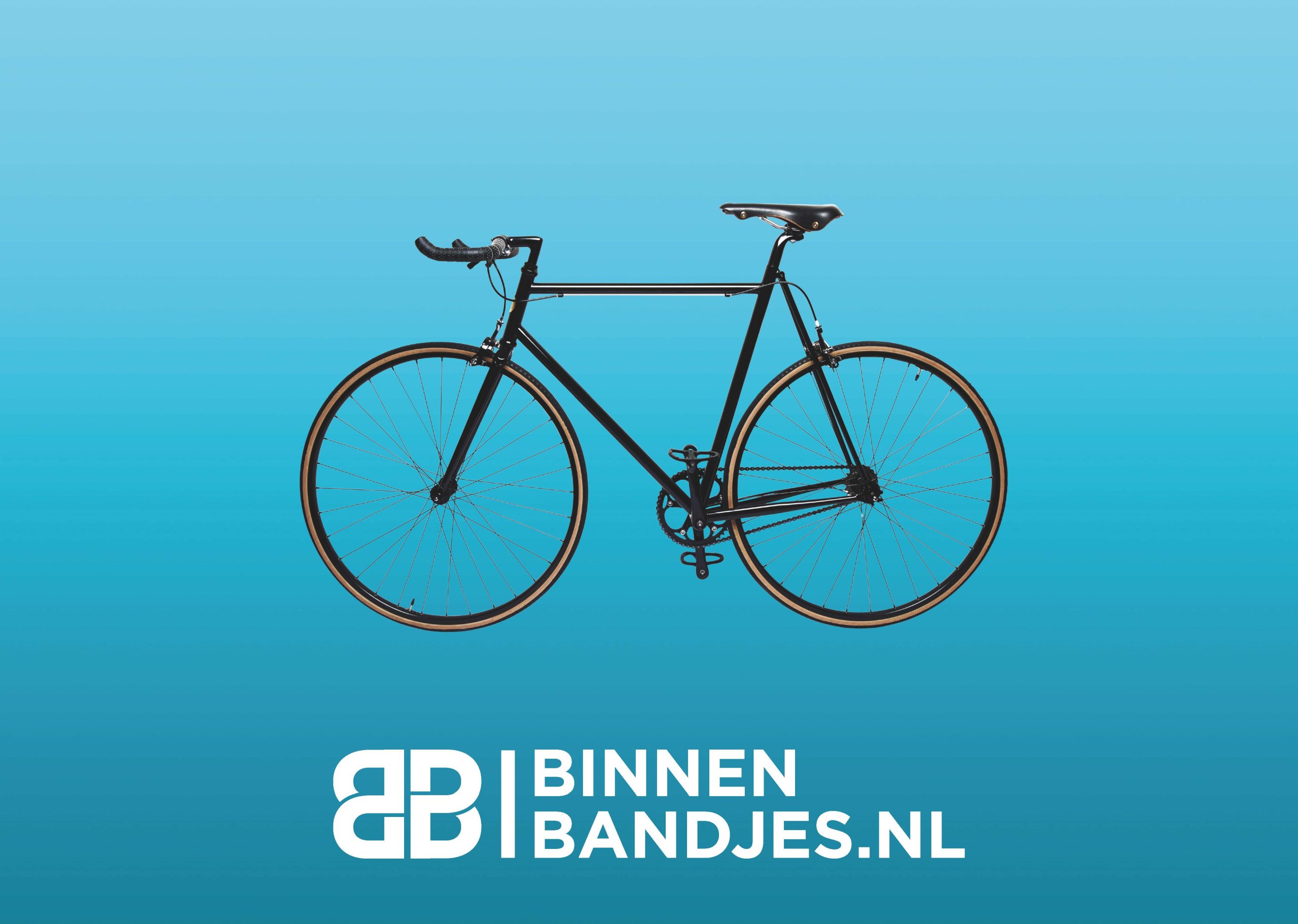
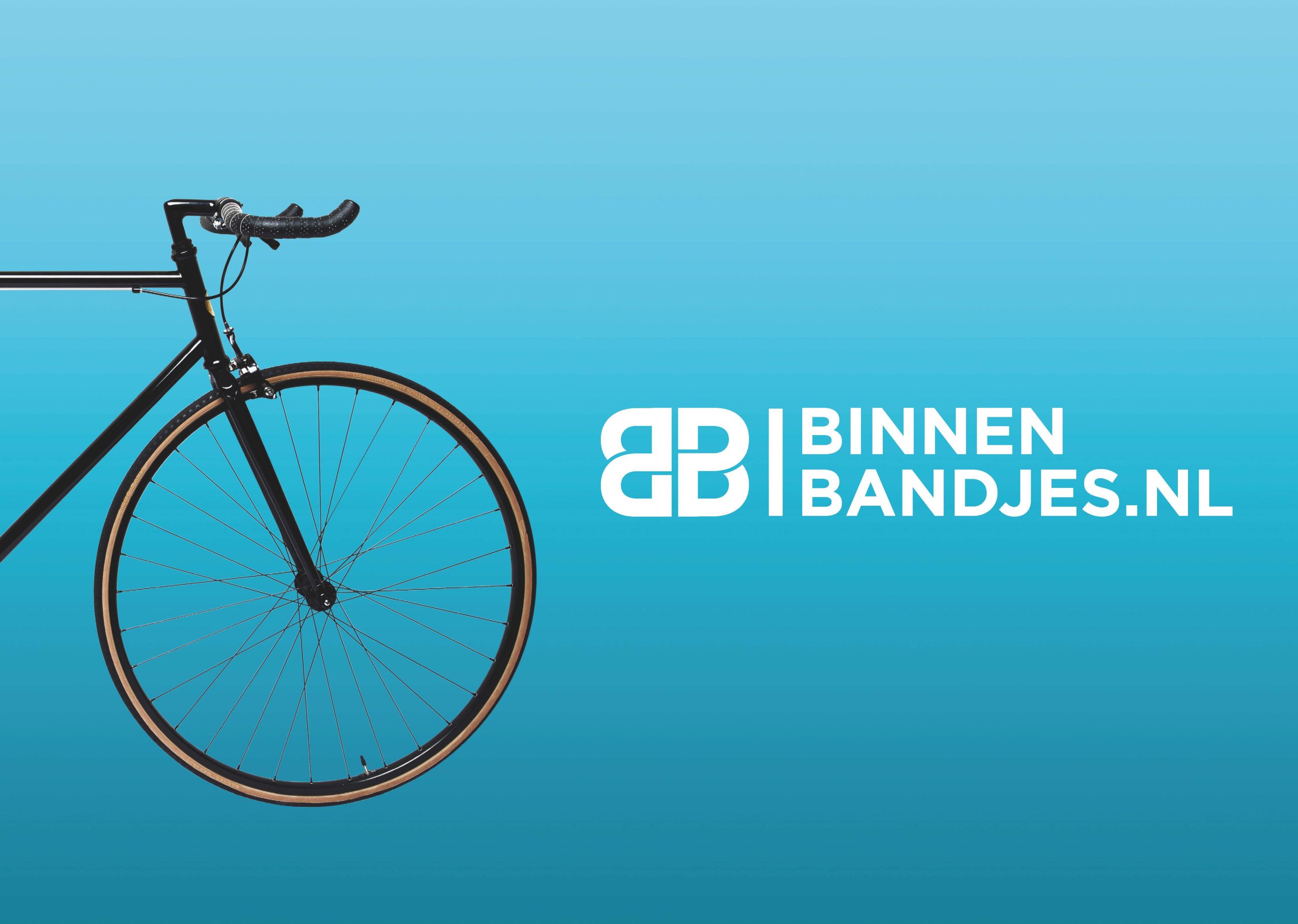
- Visuals: Clean, simple, and elegant with strong isolated photography.
Concept and Inspiration: The branding aimed to connect with all types of cyclists, from intense trainers to daily commuters. The logo’s negative space represents pedal movement, while the cuts around curves symbolize wheel motion, creating a dynamic and reliable image.
Process:
- Research: Understanding the needs and preferences of the target market, including intense cyclists and daily commuters.
- Conceptualization: Developing a brand that conveys reliability and strength, appealing to cyclists who need quick and dependable tyre repair solutions.
- Design: Creating a logo that reflects movement and dynamism, complemented by a clean and bold aesthetic.
- Finalization: Ensuring the brand stands out with bold typography and strong visuals, emphasizing Binnenbandjes.nl’s commitment to quick, reliable service.
The final product successfully communicated Binnenbandjes.nl’s dedication to providing fast, dependable tyre repair kits via post, earning recognition for its innovative and impactful design.
Client
Vino Veloce
Year
2021
Deliverables
- Custom Wine Label Design
- Traditional Photography Integration
- Hand-Drawn Illustrations
- Comprehensive Branding Package
- Custom Illustrations


